Thursday, 31 January 2013
Front Cover Draft.
The first image shows the draft of my magazine front cover and what I want it to look like. The second image is an 'XXL' front cover which my draft has formed its basis from. Its a direct comparison to the 'XXL' magazine with a little bity of twist, i've added my own style to the magazine I want to create and how I want it to look.
Wednesday, 30 January 2013
Double Page Spread Draft.
 |
Tuesday, 29 January 2013
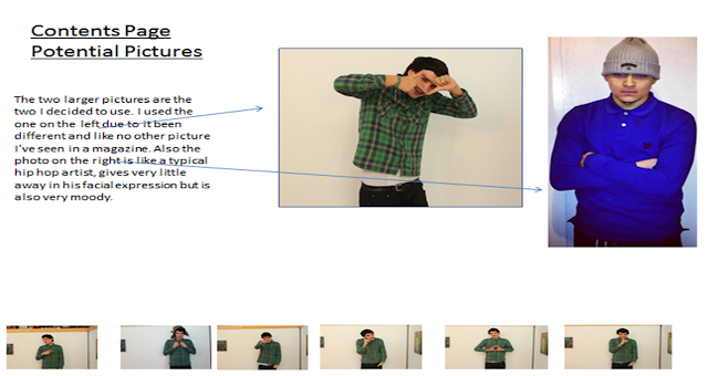
Draft Contents Page

Monday, 28 January 2013
Contact Sheet For Double Page Spread
This contact sheet shows the pictures I took for my double page spread and the picture I used and why I used it. Also shows what the original image looks like before I edited it and cropped it.
Sunday, 27 January 2013
Tuesday, 1 January 2013
Front Cover Of My Magazine 'Clique'
For my final production of my front cover I took so much care in the main image and how I wanted it to come across to the public. At first I had the picture in colour with a shadow around Vila (D'angelo) but with the bold red masthead I decided it looked a bit messy. The readers would not know where to look, as there was that much going on. That is why I decided to make the image black and white, with a bold red masthead, so the readers would first be drawn to the name and then with the effect I managed to do on Photoshop by lighting D'angelo up it then draws you to the photograph.
I tried to copy the style of the magazine 'XXL' and there masthead is always the first item you look at when looking at there front covers.
I edited the photo and turned into black and white, secondly I turned up the yellow colour on the contrast which enabled me to make his skin tone lighter so he blended in with the picture. I also added a vignette using the gradient tool. Lastly I used the burn tool to enhance the shadows in certain parts of the photograph, the burn tool was at 5%, this brought out lots of his features out such as his eyes.
Originally I said my mast head was going to be the font 'Capture it' and size 72pt. I kept the font capture it as its big bold and in your face however for it took look right on my page I had to make the size 240pt. I used red as reds the same colour as the magazine 'XXL' and the colour reds meaning is power and that's exactly what hip-hop artists talk about in there music. I the used the font 'let me ride' for the words 'world exclusive'. This was in size 60pt. For the sub tittles I used the font 'orator' and they were in size of 35pt. Lastly for the word 'D'angelo' I used the font Moiser at 40pt, however there wasn't an apostrophe in that font so I cleverly cropped an apostrophe in.
Subscribe to:
Comments (Atom)


